If you followed my previous posts regarding automated Stata and LaTeX integration you might already have a good idea how estout works and how a table can be printed in LaTeX in an aesthetically pleasing way. This post is about improving the print quality in LaTeX even further. If you are new to LaTeX and Stata integration please read my introductory post and my follow up post that solves some problems.
The Problem
You might have encountered two problems following the instructions of my previous posts:
- You generate hundreds of
overfull hbox warningsin LaTeX if you decimal-align the results. - If you use different math- and text-fonts, symbols in the table are set in the math-font, which can look ugly.
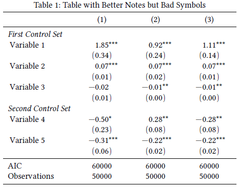
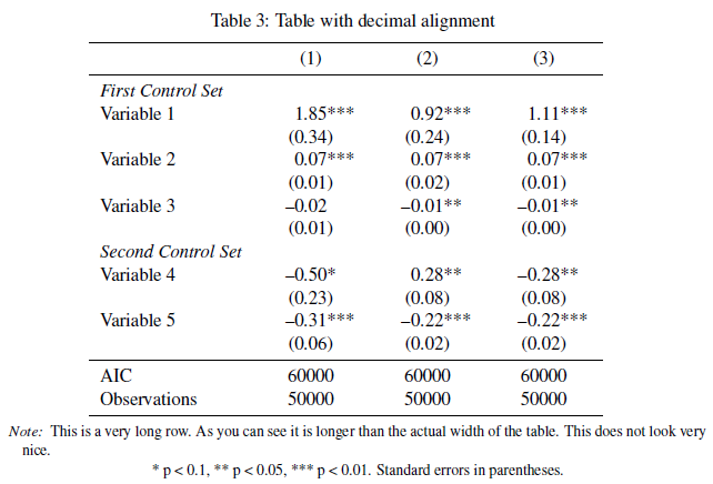
Both are relatively serious problems. The first occurs because siunitx, the package we use to decimal-align the values requires precise information about how much space there is in each column before and after the decimal limiter. Consider the table on the right: we have a maximum of 2 characters on the left side of the decimal limiter (minus + one integer) and a maximum of 5 characters on the right side (two decimals + three stars). Hence, we need to specify this in siunitx by S[table-format=-1.5] to avoid overfull hbox warnings. But I don’t like this, because then we are not able to create really compact tables and furthermore it can happen that the column headline is not perfectly centered relative to the integer and digits.
The second problem occurs because siunitx sets symbols that are specified as input-symbols (i.e. they do not interfere with the decimal-alignment) in math-mode. If you use a complete font such as Latin Modern you won’t notice this because both text- and math-font look the same. But if you use distinct fonts, the result will be as the one in the example above: minus symbol and brackets are set in “Euler”, a very pretty math-font, but the rest is set in Linux Libertine, my favourite free LaTeX font. Obviously, this result is not optimal.
The Solution
It is easiest when you download the Sample Document (4506 downloads) and the Sample Table (3829 downloads) used to generate the example to see how the solution works. I load the following fonts:
\usepackage{libertine}% Linux Libertine, may favourite text font
\usepackage[euler-digits]{eulervm}% A pretty math font
In the next lines we create the well-known \sym command and load and customise siunitx, now simpler than in my previous posts.
% *****************************************************************
% siunitx
% *****************************************************************
\newcommand{\sym}[1]{\rlap{#1}}% Thanks David Carlisle

\usepackage{siunitx}
	\sisetup{
		detect-mode,
		group-digits		= false,
		input-symbols		= ( ) [ ] - +,
		table-align-text-post	= false,
		input-signs             = ,
        }
Now begins the hacki bit: as I mentioned before I don’t like to reserve space for all characters in siunitx. What I want to do is tell siunitx only how many integers and decimals there are – I don’t care about minuses, brackets or stars. Apart from being simpler, it also has the advantage of being able to create really compact tables and also to make sure that the column title is centered relatve to the numbers. If you reserve space for all characters, the title might look offset, because it is centered relative to all characters, while “the eye” focuses on the number to create an aligning point.
The solution to the first problem, avoiding overfull hbox warnings, is to tell LaTeX not to reserve any space for minusses, brackets and stars. The \llap{...} and \rlap{...} commands will do this, we just need to tell LaTeX to wrap all symbols in the table in those commands. The solution to the second problem is to substitute the specific characters that are set in math-mode (in my example minusses and brackets) with their text-mode equivalents. This is done in the following lines:
% Character substitution that prints brackets and the minus symbol in text mode and does not reserve any space. Thanks to David Carlisle
\def\yyy{%
  \bgroup\uccode`\~\expandafter`\string-%
  \uppercase{\egroup\edef~{\noexpand\text{\llap{\textendash}\relax}}}%
  \mathcode\expandafter`\string-"8000 }

\def\xxxl#1{%
\bgroup\uccode`\~\expandafter`\string#1%
\uppercase{\egroup\edef~{\noexpand\text{\noexpand\llap{\string#1}}}}%
\mathcode\expandafter`\string#1"8000 }

\def\xxxr#1{%
\bgroup\uccode`\~\expandafter`\string#1%
\uppercase{\egroup\edef~{\noexpand\text{\noexpand\rlap{\string#1}}}}%
\mathcode\expandafter`\string#1"8000 }

\def\textsymbols{\xxxl[\xxxr]\xxxl(\xxxr)\yyy}
Here we create a new command \textsymbols that incorporates all issues discussed above. To make sure that our tables are printed correctly, we have to adapt the \estwide and \estauto commands accordingly. All that has changed is the added \textsymbols command.
\newcommand{\estwide}[3]{
	\vspace{.75ex}{
		\textsymbols% Note the added command here
		\begin{tabular*}
		{\textwidth}{@{\hskip\tabcolsep\extracolsep\fill}l*{#2}{#3}}
		\toprule
		\estinput{#1}
		\bottomrule
		\addlinespace[.75ex]
		\end{tabular*}
		}
	}

\newcommand{\estauto}[3]{
	\vspace{.75ex}{
		\textsymbols% Note the added command here
		\begin{tabular}{l*{#2}{#3}}
		\toprule
		\estinput{#1}
		\bottomrule
		\addlinespace[.75ex]
		\end{tabular}
		}
	}
Finally, the command to print the table in LaTeX:
\begin{table}\centering
  \begin{threeparttable}
    \caption{Table with Better Notes and Better Symbols}
    \estauto{table}{3}{S[table-format=1.2,table-column-width=20mm]}
    \Figtext{Some basic text about the table.}
    \Fignote{With `threeparttables' even long notes don't get wider than the table. The result is much more typographically pleasing.}
    \Figsource{We good the data from here.}
    \Starnote
  \end{threeparttable}
\end{table}
Note the specification of the S-column, where we only specify the maximum number of integers and decimals, and we fix the column-width to 20mm: S[table-format=1.2,table-column-width=20mm].
The result is a pretty table without any LaTeX warnings and where the minus and brackets are set in the correct font.
In the next post we go a bit further: If you are a fan of typography you might use old-style figures, however, it is not recommended to use those in tables. Using Open-Type fonts and XeLaTeX and LuaLaTeX we can print numbers in the text in old-style fonts, but numbers in the table in lining numbers.
Issues with Amsmath
If you load the amsmath package the above solution will not work. You need to add the following lines after you load the package (thanks to David Carlisle for this and many other problems that he helped to solve!):
\makeatletter
\edef\originalbmathcode{%
    \noexpand\mathchardef\noexpand\@tempa\the\mathcode`\(\relax}
\def\resetMathstrut@{%
  \setbox\z@\hbox{%
    \originalbmathcode
    \def\@tempb##1"##2##3{\the\textfont"##3\char"}%
    \expandafter\@tempb\meaning\@tempa \relax
  }%
  \ht\Mathstrutbox@\ht\z@ \dp\Mathstrutbox@\dp\z@
}
\makeatother


